How to Choose the Right Typeface
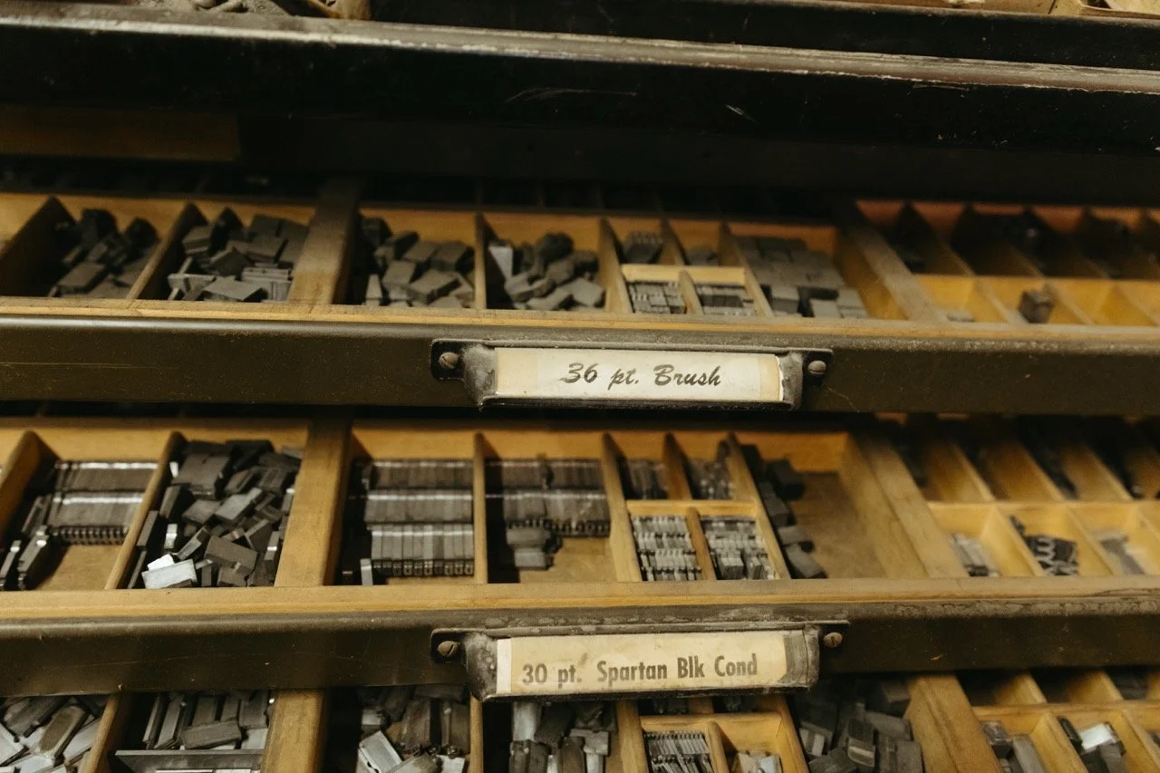
A typeface choice quietly shapes how people feel about your project before they read a single word. A font can make your work feel polished, trustworthy, and on‑brand; a careless one can make it look amateur or confusing.
What is a typeface?
A typeface is the design of a set of letters, numbers, and symbols that share a common visual style, like Times New Roman, Helvetica, or Garamond. A font is a specific version of that typeface (for example, Helvetica Bold 12 pt), so “typeface” is the broader design, and “font” is one instance of it.
Why fonts matter
Typography directly affects readability and accessibility. Clear, legible type helps people absorb your message quickly rather than struggling to decipher it.
Fonts carry personality: people often describe typefaces as serious, fun, elegant, or playful, and those impressions color how they interpret the content.
Different font styles trigger different emotional associations; for example, classic serifs often feel formal and trustworthy, while many sans serifs read as modern and clean.
How people perceive type
Research on “print personality” finds that readers attribute traits like masculine/feminine, mature/youthful, or formal/casual to different typefaces, beyond the literal words on the page.
Cognitive and branding studies suggest that easier‑to‑read fonts increase trust and can even boost conversions and user engagement, because readers feel more comfortable and confident with the information.
Round, open letterforms tend to feel friendlier, while sharper, more angular shapes can come across as technical or severe, even if the text itself is neutral.
Tips for choosing a typeface
Start with purpose: is this for a long article, a logo, a slide deck, or a social post? Text‑heavy projects need simple, highly legible type; logos and headlines can be more expressive.
Match the mood: list a few adjectives for your project (e.g., warm, authoritative, playful) and look for fonts whose documented personality or typical uses line up.
Think about medium: check how your typeface performs on mobile, in print, and at small sizes; good line spacing, contrast, and x‑height are crucial for readability.
Practical pairing advice
Use contrast with restraint: one typeface family with several weights is often enough, but if you pair, combine a strong display face for headings with a calm, readable text face for body copy.
Look for harmony: typefaces from the same foundry or designer often share proportions, making serif–sans pairings feel cohesive without being boring.
Test with real content: drop your actual headlines and paragraphs into a mockup and skim it like a distracted reader; if your eyes glide through comfortably, you’re close to the right choice.
Want a professional eye to help you make your project as eye-catching and polished as possible? Reach out to Heather Henthorne at 330-262-6847 or heather@woostercolorpoint.com for a consultation!
